Archive for the ‘ucd’ Category
prototyping with iOS Storyboarding in Xcode
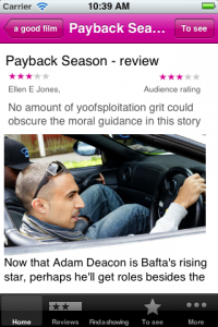
I was happy to read How To Prototype In Xcode Using Storyboard. It is good to see a resource on using Xcode Storyboarding from a designer’s perspective as I think it has huge potential if you are doing a lot of prototyping for iOS devices. I made a prototype of a Guardian Film app last year using Xcode. It took a couple of days but that included learning my way around Xcode and when it was done we could load it onto an iPhone for user testing because it was an iphone app (if not exactly something you would launch).
We didn’t go on to develop the test into a full product but it would have been interesting to see whether it was worth the developers building on the Storyboard app or if they’d have needed/wanted to start again from scratch.
I had a load of notes that I was intending to turn into more detailed instructions but as I haven’t gone back to Storyboard since this is all I have…
Note: compatible with iOS 5+ only.
Storyboard is effectively a flowmap, but one that actually generates an app. You can add dummy/fake content or if you can handle a bit of code (or know someone who does) you can pull in the real content.
Workspace components
The canvas
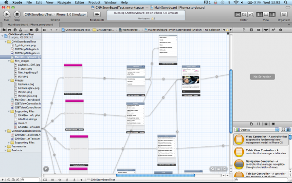
This shows the flowmap or storyboard in the central pane of the workspace (also called standard editor?). You select mainstoryboard from the project navigator to open the storyboard editor if it isn’t showing (I have  managed to get stuck with another editor open and be unable to switch back to the standard/storyboard editor).
There’s an arrow in a circle that collapses part of (the standard) editor that shows the app as a (file hierarchy?) rather than a flowmap. If you can’t access an element on the canvas (say it is ‘below the fold’) then you can edit it via the ‘hierarchy pane’. You may also need to rearrange elements in the ‘hierarchy pane’ if you need an element visible in the canvas so you can create a segue.
Navigators (on the left)
- project navigator (cmd +1) shows the file structure of your workspace
- symbol navigator (cmd + 2)
- search navigator (cmd + 3)
- issue navigator (cmd + 4 )
- debug navigator (cmd + 5)
- breakpoint navigator (cmd + 6)
- log navigator (cmd + 7)
You can change navigator display using the icons at the top of the navigator, or the edit menu or the keyboard shortcuts shown above (cmd + 0 to remove all navigators).
Libraries(bottom right)
- file template library
- code snippet library
- object library – drag the controls from here onto the canvas
- media library
Inspectors (right, above the object library)
View these for an object by selecting the relevant object on the canvas.
- file
- quick help
- identity  – use to change class of object
- attributes – lots of controls of the content/layout etc of each object
- size – mainly controls the relative positioning of the object
- connections
Components of a storyboard
Scene
A scene is a screenful of content or view. (Synonymous with view controller?)
cmd+ click to move as a group
Segue
A segue is a transition between view controllers.
Segue types:
- push: “pushes the destination view controller onto a navigation controller’s stackâ€
- modal “ presents the destination view controllerâ€
- custom “design your own transitionâ€
You ctrl+drag to create a segue (/relationship?) between scenes. You’ll be asked to pick transition type but you can change this later in the attribute inspector if you select the segue.
There’s also ‘relationships’ between container and child containers but are these segues or  something different? I don’t entirely understand segues versus relationship.
- modal segue completely obscures screen below, slides up temporarily
- nav controller pushes one view on top of the other = segue
- can’t use segue for cancel/done buttons (need delegate?) “no such thing as a reverse segueâ€
- automatically get back navigation when using some controllers but not others. Use push segues between parent and child in a hierarchy to maintain the navigation and tool bar
Note: You can only edit the elements of a scene when viewing in 100%, although you can create segues between scenes at any zoom.
Controllers
- container view controllers display content owned by other view controllers. Each type of container defines its own interface to manage its children
- content view controllers present content on the screen using a view or a group of views
- shows data
- collects data
- performs a task
- navigate between a set of available commands
Types of controllers:
- view controller: the fundamental view-management model.
- split view controller
- reference library controller
- table view controller
- navigation controller (subclasses available from the Identity inspector). Manages the navigation bar and the button to navigate back
- Image picker controller
- Video editor controller
- tab bar controller
- page view controller
To get a split view or ref library controller, add a view controller then go to the Identity inspector and change the class. Same process applies for turning a nav controller into an image picker or video editor.
The initial view controller is a setting that determines which scene is the start scene when you launch the app. Select a controller, view attributes and tick “is initial view controllerâ€. I think this automatically un-ticks this for whichever controller was previously the intial view controller.
Objects
Note: check the properties of a generic object if you can’t see the specific one you want. You can often change the sub-type.
Types of objects available:
- label
- round rect button – can be turned into a variety of buttons
- segmented control
- text field (creates a text field that the end-user can edit – use label for uneditable content?)
- slider
- switch
- activity indicator view
- progress view
- page control
- stepper
- table view
- table view cell – has a number of variations you can choose in attributes
- image view
- text view
- web view
- map view
- scroll view
- date picker
- picker view
- Ad BannerView
- View
- Navigation bar – has attributes that control colour and style
- Navigation item – can be turned into a variety of buttons
- Search Bar
- Search bar and search display controller
- toolbar
- bar button item – can be turned into a variety of items
- fixed space bar button item
- flexible space bar button item
- tab bar
- tab bar item – can be turned into a variety of items
That’s as far as my notes go. If I do another project with Storyboard then I’ll add to this.
my dumb phone
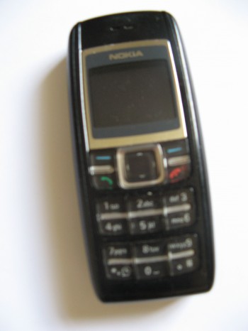
A set of phone accidents and fails has resulted in a series of rapid steps backwards down the hierarchy of phones, from lovely Nexus 4 (cracked screen courtesy of vengeful cat) to crappy Samsung Galaxy Mini (it forgot how to actually make phone calls after less than a year) right back to my trusty Nokia (recently fully submerged in water but still working fine).
It’s not really that long since I was last using it. I stuck with it throughout most of my time at the Guardian. Now to be fair I also had and used one or more of those internet thingamys throughout but the Nokia remained my *phone* for quite some time. At one point I had  an iPad, HTC Desire, Samsung Galaxy Mini (both Android) and HTC Mazaa (WP7). I think I only had them all on me at the same time once.
So why stick with the old thing when I had access to the new kit? Well the lovely shiny things fail to meet two key needs of this user.
- Battery life. My dumb Nokia lasts a week on one charge. My phone is part of Iain’s lone worker system so the battery being dead because I’ve been using apps all day is not acceptable when chainsaws are in use.
- Undesirability on the streets of N17. No-one with any self respect or commercial sense would steal this phone. I’ve got very little qualms about walking out of Turnpike Lane or Seven Sisters using it.
- It doesn’t stick to your ear when being used as a phone.
So whilst I’m missing the Nexus 4, I am also rediscovering the joy of a phone that just focuses on being a phone.
short thumbs and phone navigation
In an early version of the BBC’s iPhone 5 launch story the main image was captioned “Apple said the larger screen could still be easily operated with one hand”.
I read that and thought, still?
Last year I spent some time using the Guardian’s iPhone app and wondered why I found it so awkward to navigate when the Android app I was used to is basically the same thing just with some Android tweaks. The awkwardness came from needing to press the back button in the top left. I couldn’t reach it with my thumb.

I couldn’t reach the top left on the HTC Desire I was using either but it didn’t matter because you navigate back using the hardware back button at the bottom of the phone. Ben Lang on Carrypad points out that the (old) iPhone dimensions are generally better for one-handed use as the squarer proportions give the thumb more range, but it’s specifically the iOS design pattern of back top left that thwarts me. Other stuff appears in the top left on Android apps but not things i need for every other interaction.
Ben makes a similar complaint about the Android interface but I don’t find the notifications to be core interactions and centre-top isn’t as hard to reach left-top.
“Both the buttons… and the status bar, are always persistent, no matter where you are in the OS. You have to constantly use the Android buttons to navigate through apps and the home screen, and you have to pull the status bar down with your thumb to access any notification that comes through to the device. The core functionality of the device involves reaching your thumb from even further below the bottom of the screen to hit the buttons, then all the way to the very top of the screen to pull the notifications menu down.”
I guess on the larger screen sizes that Ben is concerned about even centre-top becomes a difficult reach. But top-left is a problem for me even on the 3:2 ratio iPhones.
Now I know I’m generally a smaller scale human being but I didn’t think my hands were exceptionally dinky. Hand anthropometry data confirmed my thumb is on the small size but not freakishly so.
Apart from Ben’s article I only came across one other piece on how (small) hand size might affect touch screen design. There seems to be more out there about larger fingers and the challenges they have with typing and target areas.
Interface Design for Single-Handed Use of Small Devices by Amy Karlson doesn’t go into huge depth about button positioning and thumb reach but she does mention:
“Additionally, thumb movement along the (top left – bottom right) diagonal direction was slower than for the other directions, suggesting a biomechanical constraint for that type of movement.”
So it appears that if my thumb and I want to use my phone single handed then I’ll have to stay away from iPhones. Given the trend with Android and Windows seems to be bigger and more rectangular, I may be increasingly out of luck there too. Â Can we have a small phone backlash please? And no important stuff top-left ok?
new wimbledon website and scary strawberries
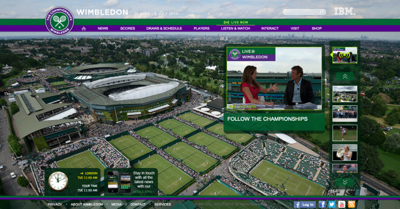
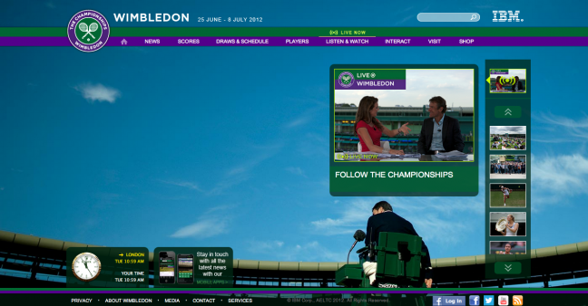
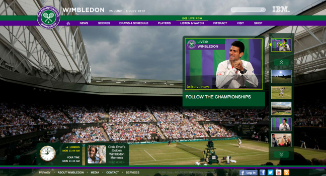
Wimbledon have a new website for this year’s tournament and one of the most striking things about it is the use of background photography.
On the homepage the background dominates with only a fraction of the real estate taken up by content or navigation. Compared to traditional lets-stuff-everything-on-there homepages this works quite well…depending on the choice of image.
There’s quite a few images being used in rotation but thus far the overhead shots of grass and the shots dominated by blue skies seem to work.
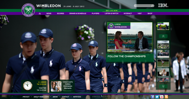
But there’s a few in the mix that I find distracting and not particularly pleasant as backgrounds. I’m not convinced by the ball boys and girls:
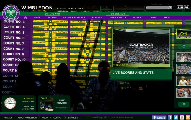
The scoreboard is far far too busy:
And the strawberries (of which there are at least two variations) just freak me out:
But I’ll forgive them if they change the blue-sky shots to soggy one when it actually does rain. No Cliff Richard please.
why is wireframing our deliverable?
When we reviewed job adverts at the BBC to understand how the market was defining the various UX job titles, the unifying part of information architect job descriptions was creating wireframes. It seems to remain the main deliverable IAs get asked to produce.
But ‘wireframe maker’ is a label that pretty much everyone would deny (except in their most maudlin moments) and it hardly covers the breadth or the essence of what we do.
I’ve been relieved to see a designer producing wireframes, as it (might have) indicated a UX style approach to design. But I’d have been upset if they’d told me my job = wire framing so it was probably a bit perverse to be particularly reassured.
It seems at the moment wireframes are being squeezed by sketching on the one side and prototyping on the other (although I’d argue these are part of same tradition rather than a revolution). But still the wireframes get produced.
So what do they prove?
- they show a way of thinking: what things, what relationships, what priority, a below the surface layer way of thinking
- they are a way of communication: one that encourages focus on things+relationship+priorities again, one that helps with building and enables it to begin earlier, and possibly one that invites more collaboration because it says “this isn’t finished”
I don’t think these proofs mean the wireframes are especially necessary, just that these are things that creating wireframes might signify about the person who made them.
putting special stuff in global navigation
Last year I was grumbling about why global navigation isn’t a good promotional tool and how people aren’t *generally* just wandering around the internet going “ooh, what’s that? I have no idea, why don’t I click it and see”.
And then I went to Food52, saw Piglet in their navigation and just had to click on it.
So now I feel I need to justify why this boxed pink piglet is different to all the stupid things I’ve ever had to argue against sticking in the global nav for ‘marketing’ reasons.
I wouldn’t base your navigation designs around my propensity to click on things that imply piglets. Although that does allude to a possible route to success with marketing via navigation. Some words are sufficiently attractive to enough people that sticking them in the navigation will always be successful e.g. “cute kittens” or “pretty women”. If the content you are marketing is said kittens or women then please do carry on.
Other reasons why this works ok:
- The basic navigation is pretty sensible
- The piglet is visually different
- It’s a single item
- It isn’t in the middle of the other items
(also worth noting that whilst I remember that Piglet did not lead to the piglets I was expecting, I can’t for the life of me remember what it actually does go to)
The BBC is also doing this at the moment for the Olympics but I’m not quite as taken with the approach. The rings do give a bit of visual difference but not enough. Â The design was tight on space already so this feels a bit squeezed in.
And I wonder about the need here, especially this early.
Now Radiotimes used to be my favourite example of doing this. I mean, their navigation was always seriously focused. Home, TV, Film, Radio. That’s it! Plus one promotional slot, styled different for a single marketing priority. The discipline involved in getting to such a short navigation and then not stuffing it with other stuff just because there was space is impressive. And then deciding that you’ll pick one and only one priority at a time, also impressive.
Well, I say single. A little part of my inner IA died the day I saw this.
But I accepted it. It is reasonable. It’s two really important shows and they probably don’t want to pick sides.
And then they did this. Live events??? That’s not a big show, it’s not something loads of people are coming to site looking for right at this minute…that’s a vaguely named marketing initiative, probably ‘of strategic importance to the organisation’.
So piglets, yes. This, no.
Christies: where a power search might be appropriate?
There are lots of useful interface elements you can add to a search results page, but the general wisdom seems to be you shouldn’t put too many of them  together.
Christies, the auction house, don’t seem to care for this perceived wisdom. Their search results are power searching heaven. I counted 12 filters (one of which you can search within), 4 sorts and 3 options for displaying the results.
So is this design overkill or understanding your audience? I’d have no qualms about including this amount of controls for an audience of professional researchers but would usually avoid it for a general audience.
I’m not hugely knowledgeable about the audience. For all it’s complexity, Christies looks far more professional and considered than most antiques websites. Especially sellingantiques.co.uk
It’s easy to imagine that the audience is very particular about the item they are looking for. If you’re a collector then being able to locate Louis XVI chairs rather than Louis XV chairs, or find an Arts and Crafts lamp rather than an Art Deco one, is a fundamental part of the experience.
I enjoyed using it but I’d be fascinated to know how typical I am of this audience. Anyone done any research?
be careful about being too ‘helpful’ with search results
The bane of my life when trying to work out what’s gone wrong with a search engine is the hidden thesaurus.
Lots of search software comes with a thesaurus that is referred to ‘behind the scenes’ to expand queries to include other queries that are *known to be equivalent*. Anyone who has spent even a short amount of time thinking about language can see why these things might become a problem.
(these files are doubly irritating as they’re usually set up without any kind of admin interface…the assumption being only the system administrator would or should edit it…and that they will of course be technical)
The expansion happens behind the scenes and the user isn’t necessarily told it has happened. This is usually bad. You need to be really really wary of expanding the users search queries without telling them. Don’t just give them results for aubergine and results for eggplant, when they only searched for Aubergine. You think you are being clever and helpful. If you’re wrong about the expansion then you are just being extremely irritating.
Or possibly worse than irritating.
I read a comment on the Guardian recently that suggested hor = mum in Danish. I thought that was wrong and searched for “hor mum” in Google. It wasn’t my most thought through search query but I didn’t expect Google to automatically convert it into “hot mum”. That was a bit of a surprising set of results.
(the word the commenter had misheard was mor)
This Google example demonstrates how you can end up with a worse situation that the user simply not getting the results they were looking for. But it is also different from the thesaurus examples that I started this talking about. Google do at least tell you what they’ve done and allow you to correct them. Given how uncertain query expansion is, best practice must be to tell the users what you’ve done.
If you tell the users you have two choices about how to tell them:
a) Suggest the expansion but don’t run it for them. Risks them missing it as an option.
b) Run the expansion but tell them you’ve done it. Still risks them missing the option to un-do
Google’s experimented with both approaches over the years. And currently has a bit of a mixed approach. Don’t assume their approach has “cracked” the problem.
why I like free-text fields in surveys
I’ve been doing quite a bit of surveying in recent weeks and I’ve been challenged over my liking for free-text fields.
My colleague/partner-in-crime was worried that the data would be too time-consuming to analyse if we didn’t turn every field into a tick box of some form. I’ve always found the free-text fields to be the ones that contain the most interesting responses so I’m willing to wade through the data.
But it wasn’t just on our side of the fence that concerns where raised. In the latest batch of responses to the survey a couple of people wrote things along the lines “why not checkboxes?” in the field in question.
(of course, if it had been checkboxes, the people who’d wanted free text wouldn’t have been able to complain to me)
An unexpected benefit of the free-text field was that I could spot the spam because they faithfully quoted our navigation back at us when asked what parts of our website they read. The humans were mostly more varied than that.
The question was about what Guardian content they read. It was deliberately vague but most people interpreted as a request for genres and listed out four or five of them. It wouldn’t have been a huge problem to have offered them the main genres and asked them to tick. It would have probably involved a little less thinking for the respondents.
I suspect people would have ticked more things if offered a list.
What I wouldn’t have got was the things that people thought were important but we hadn’t thought important enough to put on the list. A lot of people chose something surprising as one of the four or five things they specifically chose to tell us they read.
As well lots of the expected genres, the responses also included:
- formats
- specific topics and countries
- things they don’t read
- how they choose what to read
- who they read
- which supplements they like
- countries
They used language we don’t use e.g. Current affairs, Entertainment, International, Global, Arts, Finance, Opinion, Economics, Sports, IT.
I was also interested to see people using Guardian specific acronyms e.g. OBO, MBM, CiF.
Most people responded with a comma separated list which was pretty easy to turn into structured data and then just mop up the stuff that doesn’t fit nicely by hand. And that mopping up gave me an opportunity to learn the data and to begin to understand it.
This wasn’t a big scientific piece of market research, just the beginning of a conversation. And that’s best done without checkboxes.
treen: the woodsman’s miscellaneous category
As a classification geek, married to a tree geek I was delighted to discover treen which Wikipedia says is “a generic name for small handmade functional household objects made of wood”.
I may start collecting miscellaneous categories from different domains…
